Navigating through the volatile world of cryptocurrency can be scary, even for experienced investors. With Bitcoin, the value keeps fluctuating every second. In such situations, figuring out when to buy and when to sell becomes a crucial task.
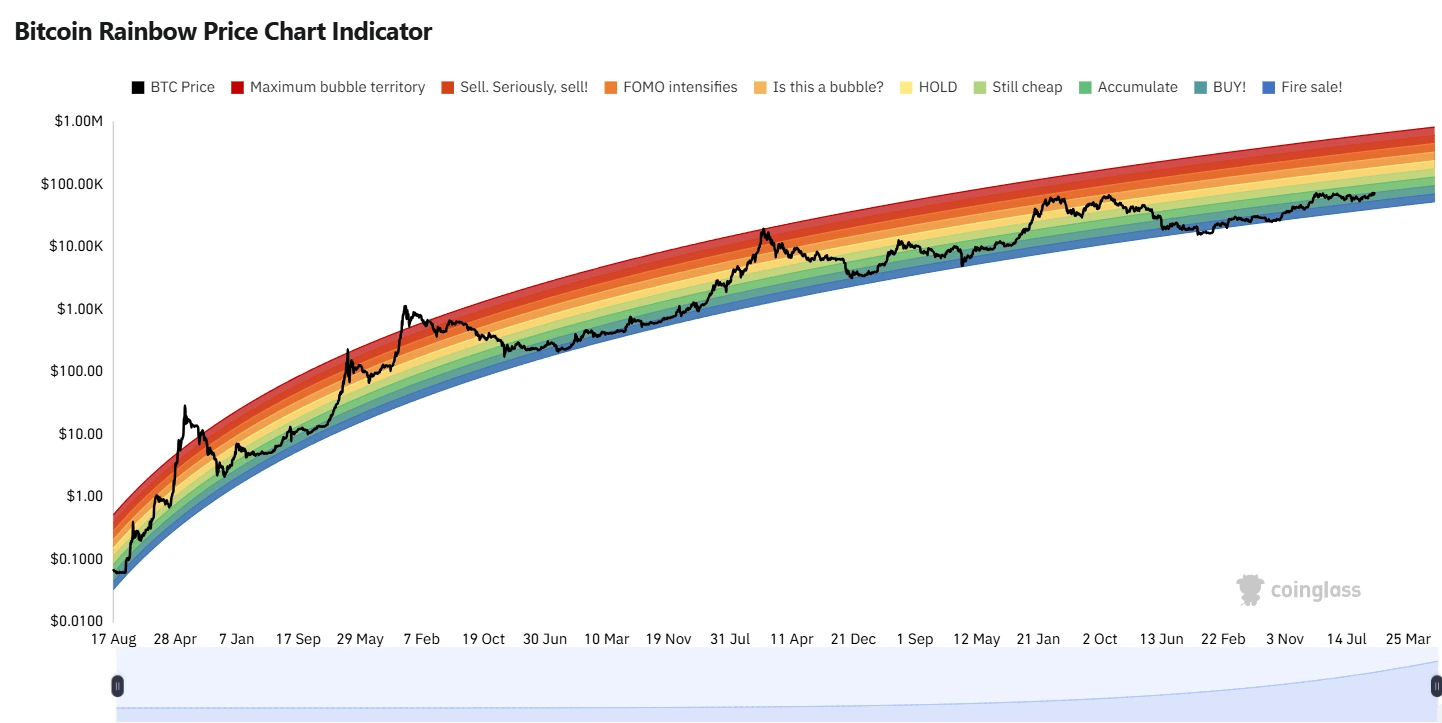
To simplify buying and selling, the Bitcoin Rainbow Chart has been designed to help you plan your entry and exit according to the market sentiments. Bitcoin Rainbow Chart is a visual tool that helps investors decode market sentiment and make calculated decisions.
What is the Bitcoin Rainbow Chart?
The Rainbow Chart is a growth curve that visualizes Bitcoin’s market sentiment and potential price direction. The Bitcoin Rainbow Chart was initially developed by a Reddit user named “azop” in December 2014, which then has then been fine-tuned by the Bitcoin community. The chart overlays color bands onto historical price data, providing a representation of market cycles.
One always has to take care that the chart is not meant to be used as financial advice. It is supposed to be used as an educational tool to help investors understand Bitcoin’s price behavior and identify potential buying and selling opportunities.
How to Read the Chart?
Advertisement
The colorful bands indicate the market sentiment stages that Bitcoin has gone through. Each color signifies a potential zone of market sentiment, ranging from “Fire Sale!” at the lowest level (blue) to “Maximum Bubble Territory” at the peak (red).
To read the Bitcoin Rainbow Chart, identify which color band Bitcoin’s current price falls into. If it is in the lower bands (blue or green), it indicates a buying opportunity, while higher bands (red or dark red) suggest a selling or profit-making opportunity. The chart helps visualize market cycles, indicating periods of potential price corrections or rallies based on historical data.
Decoding the Bands
Cooler Colors (Blues and Greens): These lower bands suggest times when market sentiment is a little quite and repressed, often observed during bear markets or during periods of low activity. Historically these zones represent potential buying opportunities, as prices are relatively low.
Mid Range Colors (Yellows): When Bitcoin price is in these middle bands, its usually in a growth phase, showing steady upward movement. This may be a balanced area for holding or for cautious buying.
Warmer Colors (Oranges and Reds): These upper bands suggest times when the market is likely overheated, with high interest. Historically, these periods have been times when investors consider taking profits, as prices have peaked.

The Limitations
The Bitcoin Rainbow Chart is based on historical price data and does not guarantee future performance. Bitcoin experiences significant price swings and volatility, which means that even though it provides historical insights, it’s not a predictor of the future prices.
The chart updates daily to incorporate the latest closing price and is meant to be used as an educational and entertainment tool rather than investment guidance.
 cryptonewsz.com