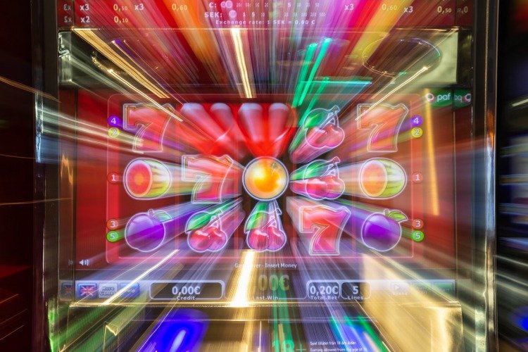
Why “Slots Look the Same” But Feel Different: Math, Pacing, And UX

At a glance, many slot games share the same “skin.” Reels, symbols, a spin button, a win meter, maybe a bonus banner that flashes when luck shows up. That sameness is not an accident. Familiar layouts reduce learning time, keep the first spin frictionless, and let a new title feel instantly usable.
Yet inside a casino lobby, two slots that look like twins can feel like opposites within five minutes. One can feel smooth and generous even during losses, while another feels tense, spiky, or oddly slow. The difference rarely comes from the theme. It comes from three quiet levers: math, pacing, and UX.
The Math Under Familiar Screens
Slot math is a set of design choices disguised as entertainment. RTP and volatility are the obvious labels, but the feeling comes from how outcomes are distributed across time. A high-volatility game can stay silent for long stretches and then erupt. A medium-volatility game can sprinkle small wins that barely cover the bet yet keep the session feeling “alive.”
Even the same RTP can produce very different emotions. One game might pay back through frequent low hits. Another might hold back until a bonus arrives. Both can be “fair” on paper, while one feels calmer and the other feels like walking on glass. That emotional texture is the real product.
Pacing: The Invisible Tempo
Pacing is how quickly information arrives and how long suspense is allowed to breathe. Fast games create a rhythm that feels like continuous motion. Slow games create weight. Neither is automatically better. What matters is whether the tempo matches the promise of the theme and the intensity of the math.
A useful way to spot pacing is to watch what happens between pressing spin and seeing the final result. Micro-delays, animations, tally counters, near-miss reveals, bonus teases, and celebratory pauses all add or remove psychological “distance” from the outcome.
Before the first list, one detail matters: pacing changes how losses are experienced. A loss that resolves instantly feels different from a loss that is stretched, decorated, and repeated with tiny suspense cues.
Pacing Tricks That Change The Feeling Without Changing The Math
-
Staged reveals: symbols land one by one to stretch uncertainty
-
Win celebrations: small hits get long animations to feel larger
-
Counter roll-ups: payouts count upward to extend reward time
-
Near-miss framing: almost-bonuses get extra visual emphasis
-
Autoplay cadence: fixed rhythm removes decision pauses and speeds sessions
After the list, the key takeaway is simple: pacing is not decoration. Pacing is session temperature control. It can cool down a swingy game or overheat a mild one, depending on how the timing is tuned.
UX: Friction, Clarity, And Trust Cues
UX decides whether the player feels in control or feels carried. Clear bet controls, readable paytables, and transparent bonus rules reduce suspicion. Confusing menus, hidden limits, or noisy overlays create a low-grade stress that turns “fun” into “work.”
Good UX also manages expectations. When a game signals “big bonus potential,” the interface should explain how features trigger and what multipliers do, without forcing a search mission through tiny icons. When a game signals “quick casual spins,” the interface should keep taps simple and feedback immediate.
A slot can be mathematically identical to another and still feel worse because the interface leaks uncertainty. Uncertainty makes every outcome feel harsher, including wins.
Sound, Motion, And Attention Budget
Audio and motion are not neutral. Bright soundscapes and constant motion push attention toward the next spin. Muted sound with restrained animation makes outcomes feel more final. Even symbol design matters. High-contrast icons read faster. Busy icons raise fatigue, especially in long sessions.
The most interesting part is how sensory design can fake “momentum.” A player can be losing steadily while the sound, particle effects, and micro-wins create a sense of progress. That is not magic. That is attention management.
Before the second list, a practical lens helps: every slot asks for attention like a social app. The difference is how honestly that attention is handled.
UX Signals That Make A Slot Feel Better Or Worse
-
Readable information: clear odds, paylines, and feature rules
-
Clean controls: bet changes feel intentional, not accidental
-
Honest feedback: wins look like wins, not like advertisements
-
Calm hierarchy: important info stays visible without clutter
-
Consistent language: bonuses and multipliers use the same terms everywhere
After the list, one idea lands: better UX does not guarantee better results, but it can make the experience feel less manipulative and more understandable. That alone changes how “fair” the same math feels.
Reading A Slot Like A Product
Slots look similar because the market rewards familiarity. The real differentiation lives under the hood and between frames. Math sets the long-run shape. Pacing shapes moment-to-moment emotion. UX decides whether the session feels clear or chaotic.
When a slot feels “different,” the difference is usually measurable. Faster cadence, longer roll-ups, more frequent micro-hits, clearer rules, cleaner controls. The skin is the wrapper. The experience is the system.