Be[in]Crypto takes a look at Bitcoin (BTC) on-chain indicators that relate to lifespan. More specifically, the Spent Output Age Bands and HODL Waves.
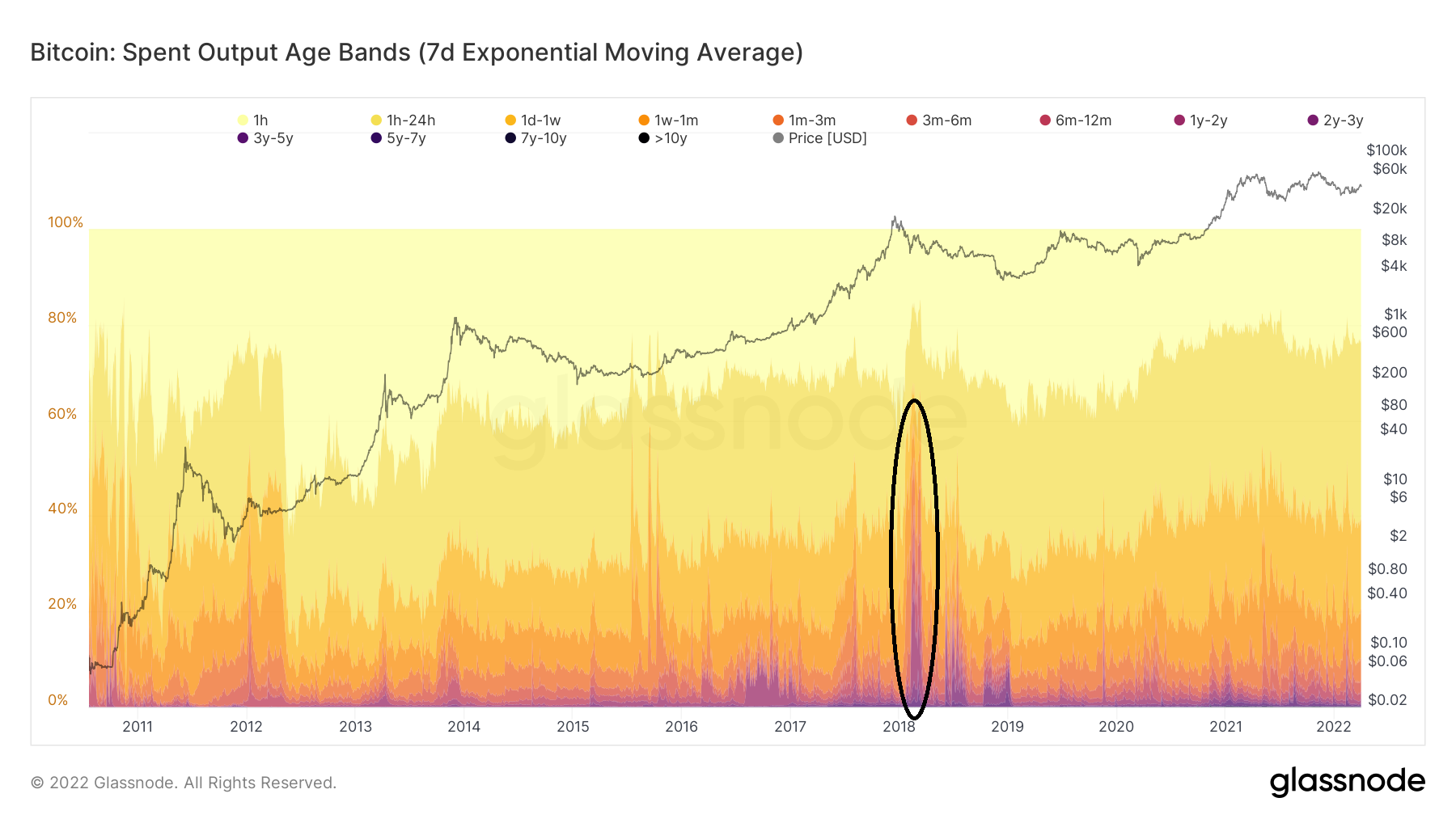
Spent Output Age Bands
SOAB takes note of a certain day’s transactions and shows the time in which the preceding unspent transaction output (UTXO) was created. It does this by using differently colored bands.
Therefore, the bands of 1m-2m show current BTC transactions that have UTXOs created between 1m-2m ago.
An interesting observation comes from looking at periods in which long-term bands spike. As seen in Feb 2018 (black circle), they usually spike at the beginning of bear markets, when BTC bounces after a significant drop.
This suggests that coins that have previously not moved for a long period of time are now being spent in anticipation of a prolonged downtrend.
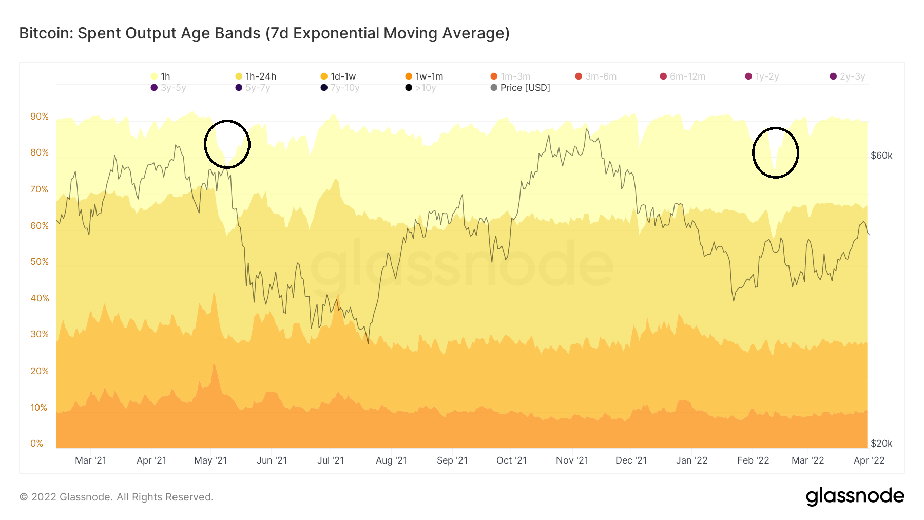
In contrast, the movement since Feb 2021 has mostly consisted of short-term participants. With the exception of two periods (black circles) in May 2021 and Feb 2022, more than 90% of the transactions had their previous UTXOs created less than a month ago.
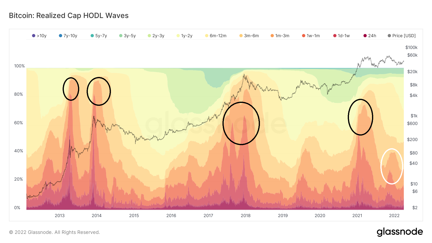
HODL waves
The HODL wave shows the percentage of the BTC that has moved in a specified period of time. Therefore, if the HODL waveband is 3-6 months, it means that 20% of the total BTC supply previously moved between 3-6 months ago.
The main difference with SOAB is that the former takes into account current transactions and measures when they had previously moved. In contrast, the latter determines the percentage of the total BTC supply that has moved in each specific time period.
Contrary to SOAB, the HODL wave short-term bands increase considerably very close to a market cycle top. The reason for this is that long-term holders are selling their coins to short-term participants.
Therefore, a market cycle top usually consists of entirely short-term participants, since long-term holders have already distributed their coins to them.
This was visible at the 2013, 2018 and the April 2021 cycle tops (black circle) short-term bands spike close to a significant market cycle top.
However, it did not occur during the Nov 2021 top (white circle), leaving open the possibility that this was just a local top instead of an absolute one.
1-2 year bands swell
During the current bull run, the most interesting development is the swelling of the 1-2 year band. This has been ongoing since Dec 2021 (black arrow).
This has occurred directly as a result of the decrease in the 6m-12m band.
Therefore, participants that entered the market during Dec 2020-July 2021 (black circle) have been holding, thus their coins have now crossed over the 1-2 year threshold.
The price from Dec 2020 to July 2021 was from $28,000 to $64,000. Therefore some of these buyers are at a loss while some are at a profit. This is a positive sign since it shows conviction in the market despite the not decisively bullish price action.
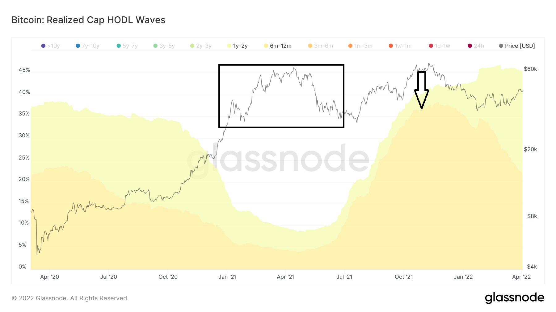
Such increases of the 1-2 year band alongside a fall of the 6-12m bands have occurred thrice prior:
- June 2012
- March to Dec 2013
- Jan 2019
In hindsight, all these three periods marked phases of accumulation prior to the beginning of a bull run.
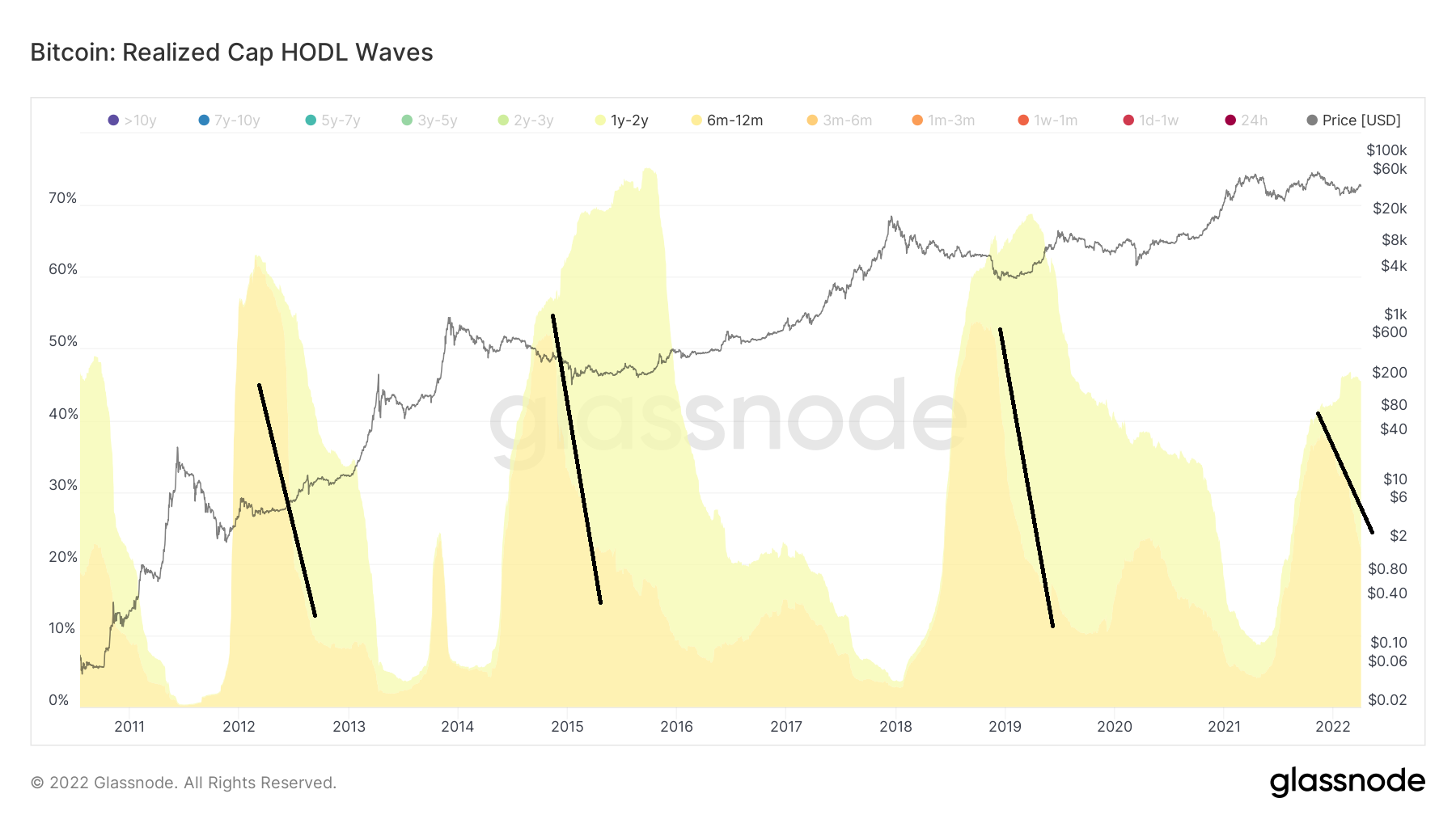
Currently, 28% of the total supply of BTC has not moved in at least a year.
For Be[in]Crypto’s previous Bitcoin (BTC) analysis, click here