The cryptocurrency market has experienced a strong shock in recent days, culminating in bitcoin’s flash crash to $30,000 yesterday.
While looking for the reasons for this extremely bearish price action, the cryptocurrency community saw several technical indicators and patterns that could be heralds of what was about to happen.
One of them is the Wyckoff distribution. This pattern is used in traditional financial markets to describe the peak of a bull market (distribution) or the bottom of a bear market (accumulation).
The interpretation by YouTube user @uncomplication, who compared the BTC price action from the last few months to the Wyckoff distribution, was particularly insightful. The most interesting fact is that the YouTuber published his analysis on April 25, 24 days before yesterday’s crash.
It is also worth recalling the signal that the community received about a month ago from the Pi Cycle Top indicator and the deepening fear on the market, which reached the extremely low value of 11 points. The Fear and Greed Index has recorded such extreme readings only 5 times in its history.
What is the Wyckoff diagram?
The Wyckoff diagram is a pattern in technical analysis that has gained popularity in the analysis of traditional financial markets.
Its creator was Richard Wyckoff (1873-1934), a famous investor in the stock markets and creator of Magazine of Wall Street. He is one of the pioneers of modern technical analysis.
A typical Wyckoff pattern consists of a series of sharp up and down price movements that create some elongated distribution. One of the tops of the diagram is the peak for this period of price action followed by an accelerated decline.
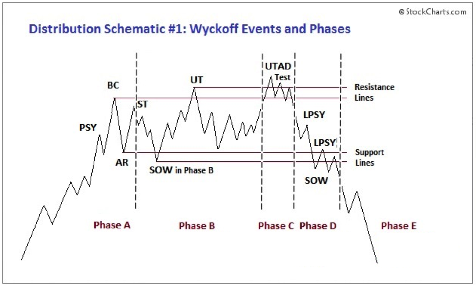
Wyckoff distribution pattern / Source: school.stockcharts.com
To get the most out of the Wyckoff diagram, it needs to be identified correctly. This is done using trading ranges, price volatility, and trading volume. Following this identification, the appropriate buying/selling decisions can be made.
The main principle here is gradual selling during the distribution period and gradual purchasing during the accumulation period, which is approximately the opposite of the distribution pattern.
The BTC correction resembles 2013
Over the past 24 hours, many members of the crypto community have drawn attention to the similarities in the bitcoin price action over the past few months to the Wyckoff distribution pattern.
Most of them referred to the almost prophetic video by @uncomplication. He diagnosed this pattern almost a month ago.
For example, the cryptocurrency trader @KingThies posted a juxtaposition of two variations of the Wyckoff distribution with a linear bitcoin chart on Twitter. He highlighted the key levels of the trading range, resistance, support, and the main phases of the distribution itself.
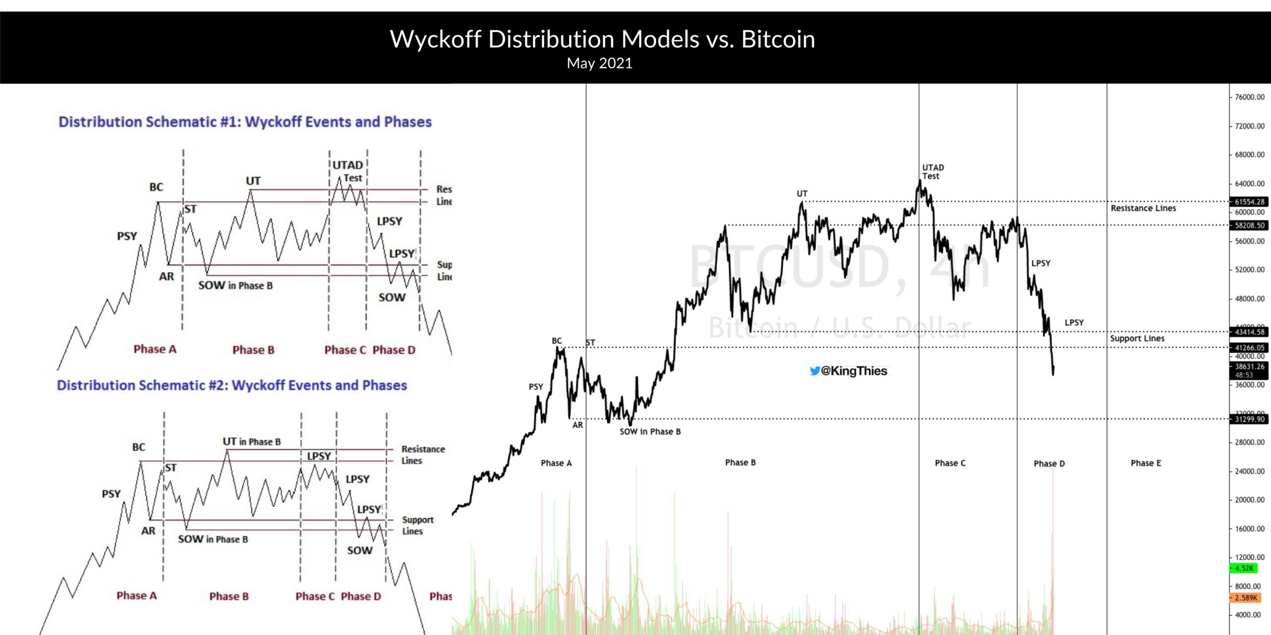
Source: Twitter
Also, crypto market analyst Benjamin Cowen published an analysis of the potential Wyckoff pattern in the context of his prediction of an intermediate peak in this bitcoin bull run.
He argues that whether it results from a realized distribution or a mere reaction to an overheated market, many signals indicated that the ongoing run could significantly improve correction.
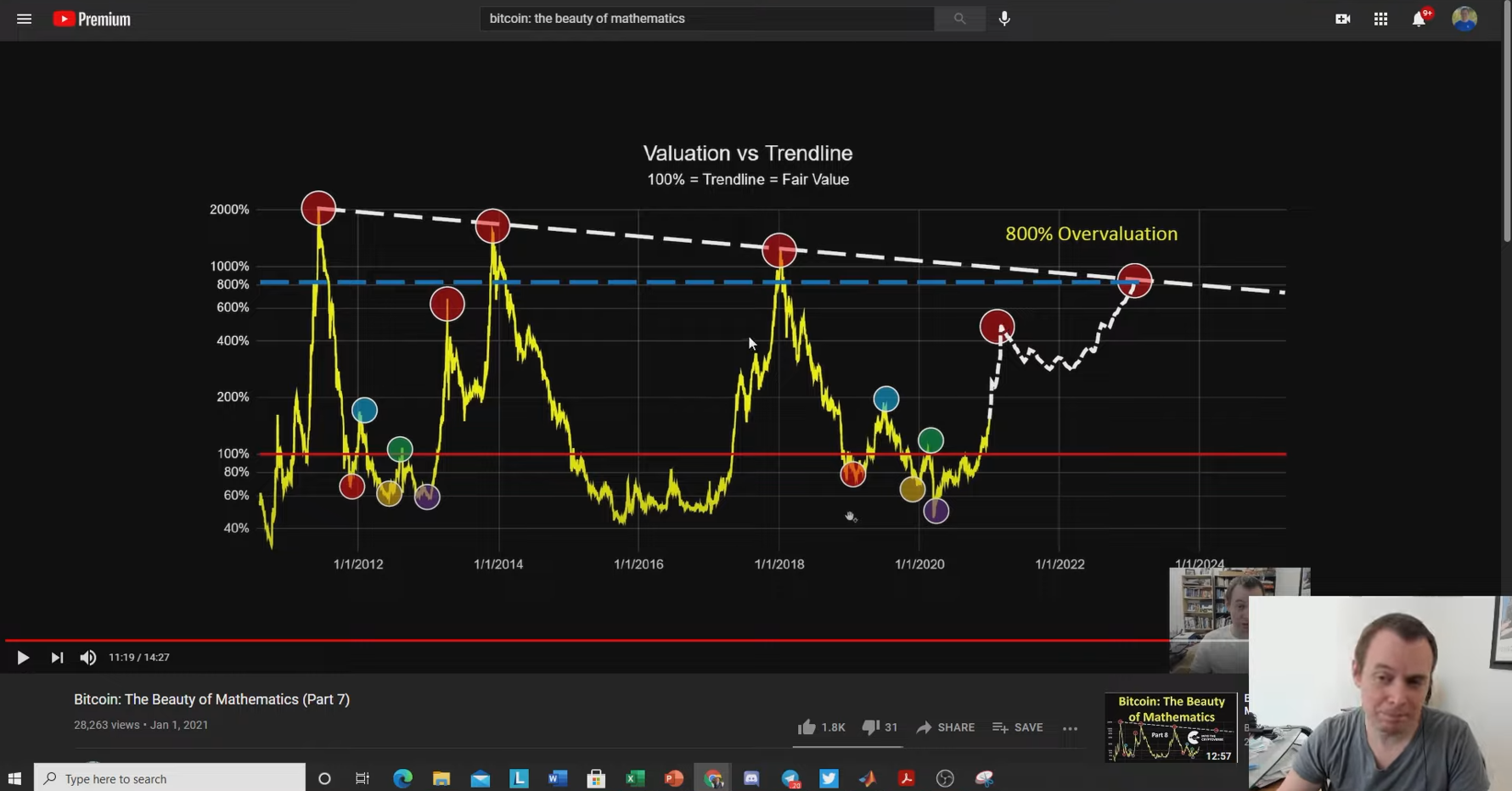
Source: YouTube
Known for using mathematical analysis tools, Cowen has repeatedly compared the current bull market to the price action from two cycles ago. During this period, bitcoin’s exponential increase led to a deeper correction. It then continued its upward move to a new all-time high set a few months later.
This idea about the similarities between the current cycle and the 2013-2014 period seems to also be supported by the well-known investor and bitcoin bull Raoul Pal.
In a tweet today, he published a chart that compares the bitcoin price from these two bull markets. As it turns out, the similarities are indeed visible.
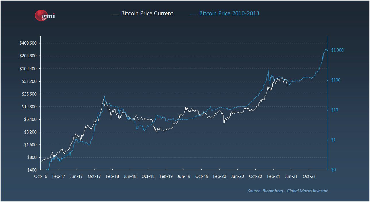
Source: Twitter
Was the Pi Cycle eventually right?
However, it was not only the Wyckoff distribution that turned out to be a harbinger of the coming drop. It is also worth mentioning the Pi Cycle Top indicator, which BeInCrypto wrote about during its recent intersection.
In retrospect, it turned out that it had predicted the (local) top of the bull run very accurately again. Despite many not believing it on the day it crossed. This simple indicator is based on the movements of two curves: twice the 350-day DMA and the 111-day DMA.
Their last intersection took place on April 12, just 2 days before the all-time high at $64,895.
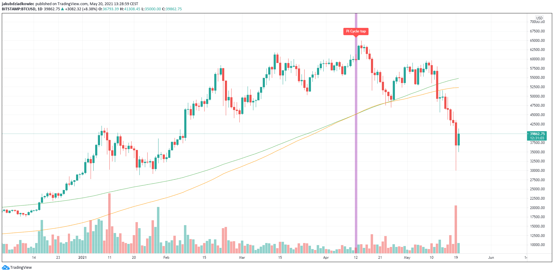
BTC chart by Tradingview
Interestingly, a few days later, the curves made another intersection. Also, today they are again far apart at around $2,500.
This means that if the market is to bounce soon and the bullish sentiment returns, the indicator would again be ready to point to a potential peak.
Extreme fear – low risk
Finally, pay attention to the behavior of the Fear and Greed Index. It is currently at its lowest levels since the COVID-19 crisis. Today, when market sentiment responds to yesterday’s crash, its value has dropped to 11/100.
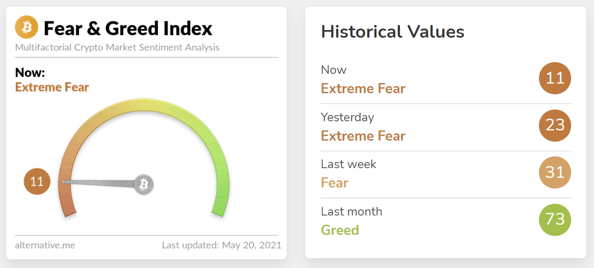
Current readings of the Fear and Greed Index / Source: alternative.me
This is an extremely low level of the indicator. Such a low rating has only been recorded only 5 times since its inception (orange circles).
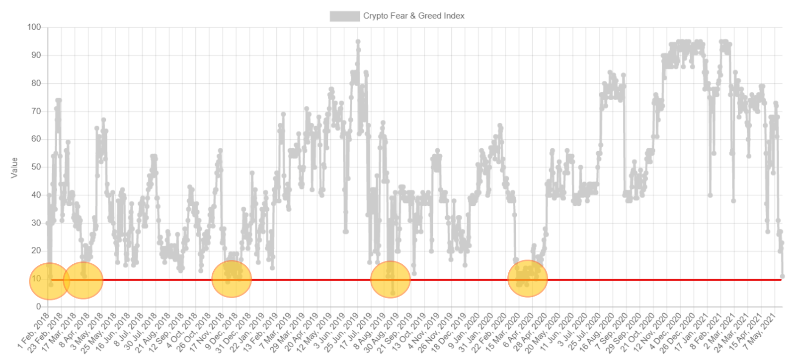
Historical readings of the Fear and Greed Index / Source: alternative.me
Extremely negative sentiment in the crypto market may indicate that the correction is not over yet.
Any possible consolidation may take months. However, this indicator should be a good suggestion for new investors that now is the right time to consider taking positions with much lower risk compared to a month ago.